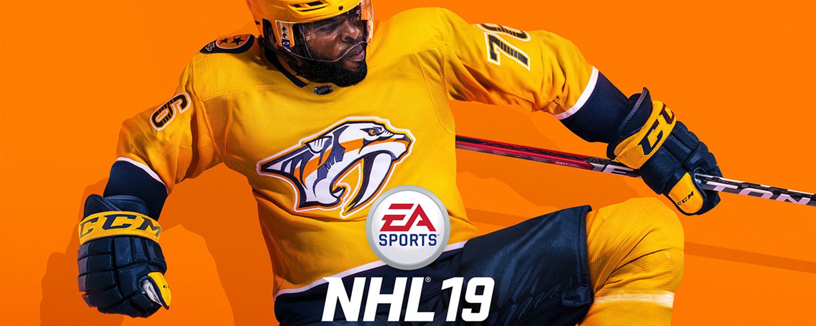
Le Canadien dévoile un tout nouveau chandail... À NHL 19!
Ça passe ou ça casse?
HabsolumentFan
La compagnie EA Sports a annoncé aujourd'hui une collaboration exclusive avec Adidas pour créer de tout nouveaux chandails pour les 6 équipes originales de la LNH dans son jeu NHL 19.
On a d'ailleurs dévoilé le nouveau chandail de chacune des formations, soit les Bruins de Boston, les Blackhawks de Chicago, les Red Wings de Detroit, le Canadien de Montréal, les Rangers de New York et les Maple Leafs de Toronto.
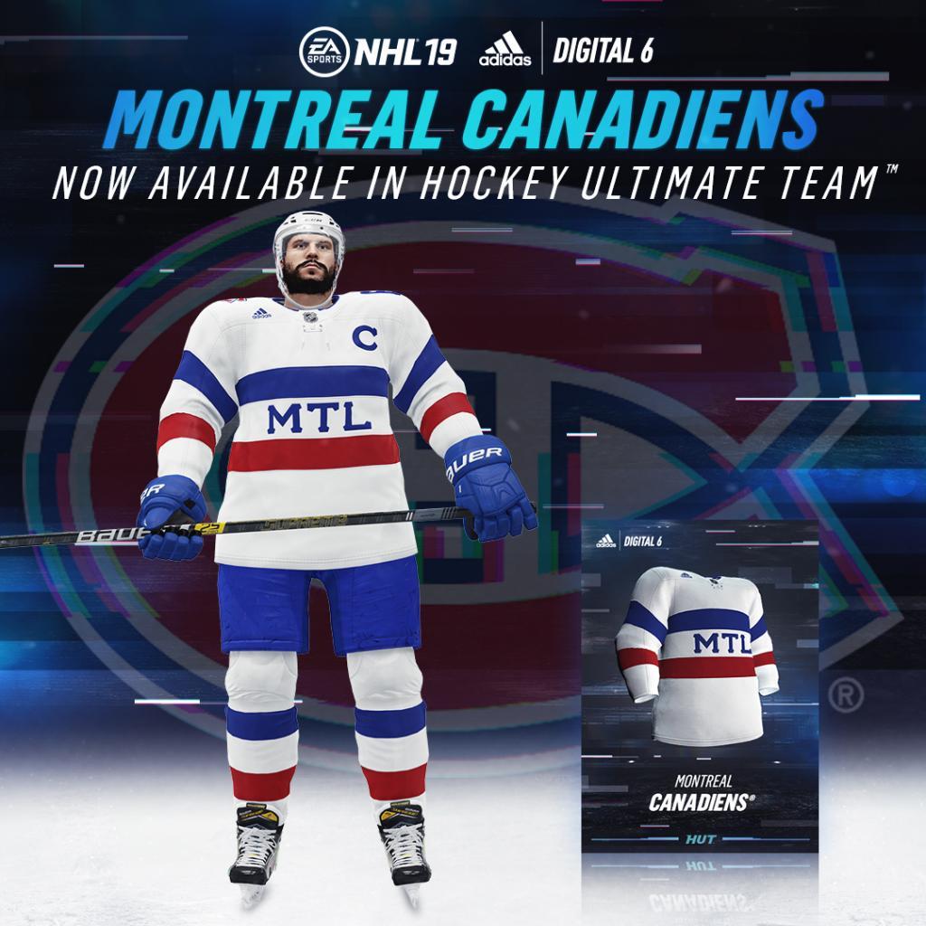
Le chandail du Canadien, qui a été complètement repensé, risque de ne pas faire l'unanimité auprès des puristes qui croient qu'on ne devrait pas toucher à l'image sacrée de l'équipe.
Voici la description du concepteur:
"Même si ça semble simple comme approche, je trouve qu'il y a beaucoup dans ce chandail. Je suis natif de Montréal alors je voulais être impliqué dans la conception du chandail de mon équipe préférée. Cette une toute nouvelle approche sur le chandail classique des Habs et j'adore comment l'intégration des lettres MTL donne un look actuel et jeune tout en incorporant un héritage Français dans les lignes."
Voyez au bas chacun des nouveaux chandails ainsi que leurs explications qui seront disponibles dans le Hockey Ultimate Team (HUT).
Comment les trouvez-vous? Ça passe ou ça casse?
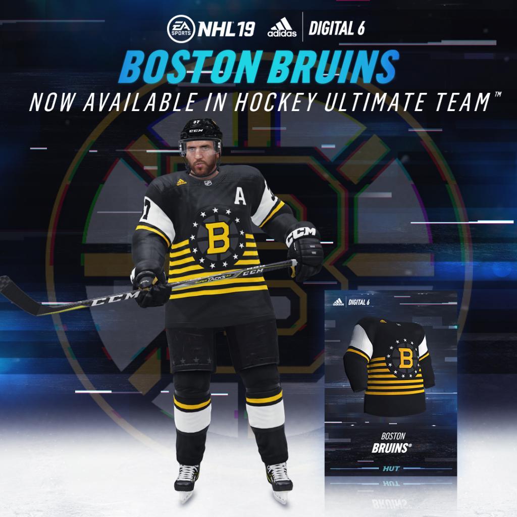
"The unbalanced colors and the circle of stars around the B are like nothing the Bruins have ever worn. There are 13 stars, representing the 13 original colonies, as the Bruins were the NHL's first American franchise.
But there's something curious about the logo, as it seems to evoke another popular Boston sports entity: Barstool Sports. One assumes that there is significant crossover between the young, predominately male audiences for the game and the site. Was this intentional? Merrill says no.
"This is about Boston. Bostonians are so proud of their history as the front line of the American Revolution that they have their own special holiday called Patriots Day. The 13 stars and stripes represent the 13 colonies that declared independence against the British. This uniform is literally dipped in stars and stripes, so that Stoolies, and every other proud Bostonian, can play 'chel' in a jersey that celebrates the city and its history in the revolution," Merrill said."
"The Blackhawks' reinvention was one of the most distinct, as the seven colors of their logo were used in multiple stripes on the lower part of the jersey, the sleeves and the socks, giving the uniform almost a pan-African color scheme.
"That was one I've been wanting to do for a long time," Merrill said. "That Blackhawks logo is so unique. There are no other sport logos in the world that have seven colors. Creating a stripe that uses all the colors was an exciting challenge. We even tried to use them in a ratio similar to the crest. The result was surprisingly successful. It's a completely new-looking stripe that still feels very 'hockey' and captures the energy of the city of Chicago.""
"Although this might seem like a simple approach, Dexter said there's a lot going on with it. "I'm a native Montrealer, so if I had to choose, I would, of course, go with my favorite team's design," he said. "It's a completely new take on the classic Habs jersey design, and I love how it feels youthful in its integration of 'MTL' while still incorporating French heritage in its striping, as well as design elements from the traditional crest by moving the 'C' to the captaincy space on the chest. It just hits home."

"If there's one Digital Six jersey that feels like it was played fairly safe, it's the Red Wings'. Except for the candy cane socks, this jersey would have been at home in a Detroit outdoor game. In fact, it was inspired by a look the Red Wings had in 1926. According to Adidas, it was also inspired by "Detroit's automotive history, adorned with the kind of racing stripes that decorated many local muscle cars."

"Although this might seem like a simple approach, Dexter said there's a lot going on with it. "I'm a native Montrealer, so if I had to choose, I would, of course, go with my favorite team's design," he said. "It's a completely new take on the classic Habs jersey design, and I love how it feels youthful in its integration of 'MTL' while still incorporating French heritage in its striping, as well as design elements from the traditional crest by moving the 'C' to the captaincy space on the chest. It just hits home."
"The influence for the Rangers' redesign was the team's primary logo, which is created here on a jersey in its full glory. Why "NEW YORK" and not "RANGERS" across the front? The designers felt that using the city's name would make it "larger than life."

"It isn't hard to draw comparisons between this Leafs jersey and the Canadian national team jerseys that seemingly inspired them. But Merrill wasn't worried about fans of other Canadian teams taking issue with the "Centre of the Hockey Universe" claiming a Team Canada look.
"I don't think so. This sweater is all about the two things that Torontonians love the most: the Maple Leafs and Canada. When the Leafs unfurl that rink-sized, blue-and-white Canadian flag with their logo as the leaf, even I get goosebumps," he said.
For now, these jerseys exist as Easter Eggs in "NHL 19," though they've been designed by the league's official gear-maker in consultation with Original Six teams.
Is there a chance that these sweaters could escape the game and enter the real world, should they prove popular enough?
"This is just the beginning. Fans want to rep their team in new and more exciting ways all the time. Looks that generate excitement in the digital world will inevitably have an influence on the physical world," Merrill said."


- Marco Normandin

D'horribles détails du viol collectif de 2018 sont révélés en cour
- Ailleurs dans la LNH
- 3 minutes à lire

- Samuel Doiron

Martin St-Louis dévoile son alignement pour le 2e match de la série
- Canadiens
- 2 minutes à lire

- Samuel Doiron
Les Capitals perdent un défenseur pour le reste des séries
- Canadiens
- 2 minutes à lire